Jet’s Value Proposition
About
How might we explain to our customers that Jet is a marketplace that provides savings through operational efficiencies?
Goal
User’s goal: to understand the value that Jet could provide as a shopping platform.
Technology’s goal: to create a more sustainable and scalable platform.
Business’s goal: to provide a clear reason to shop at Jet in order to acquire more new customers and allow for bigger baskets.
My Role
·Concept definition
·UX Lead
·UX Design
·Visual Design
·Production Design
Credits
UX Design Direction: Miguel Fernández
Visual Design: Jessica Anerella , Pablo Dodda
Research: Ben Babcock
Prototyping: Russell Calder
The challenge
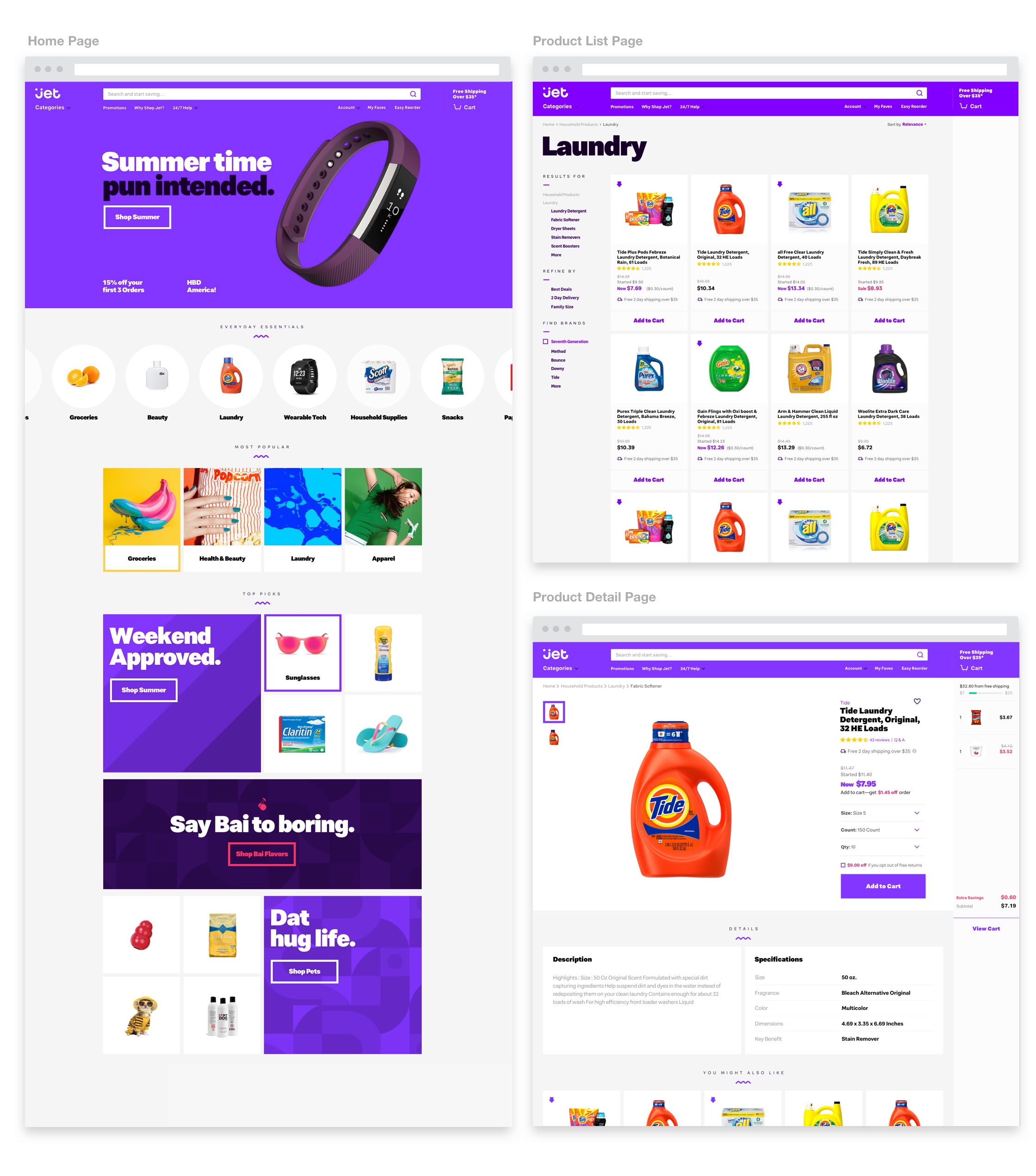
As Jet changed its business model and decided to move away from being a membership club, the design team was challenged to explain the company’s value proposition: The ability to provide "Smart savings" through a number shopping decisions across the experience.
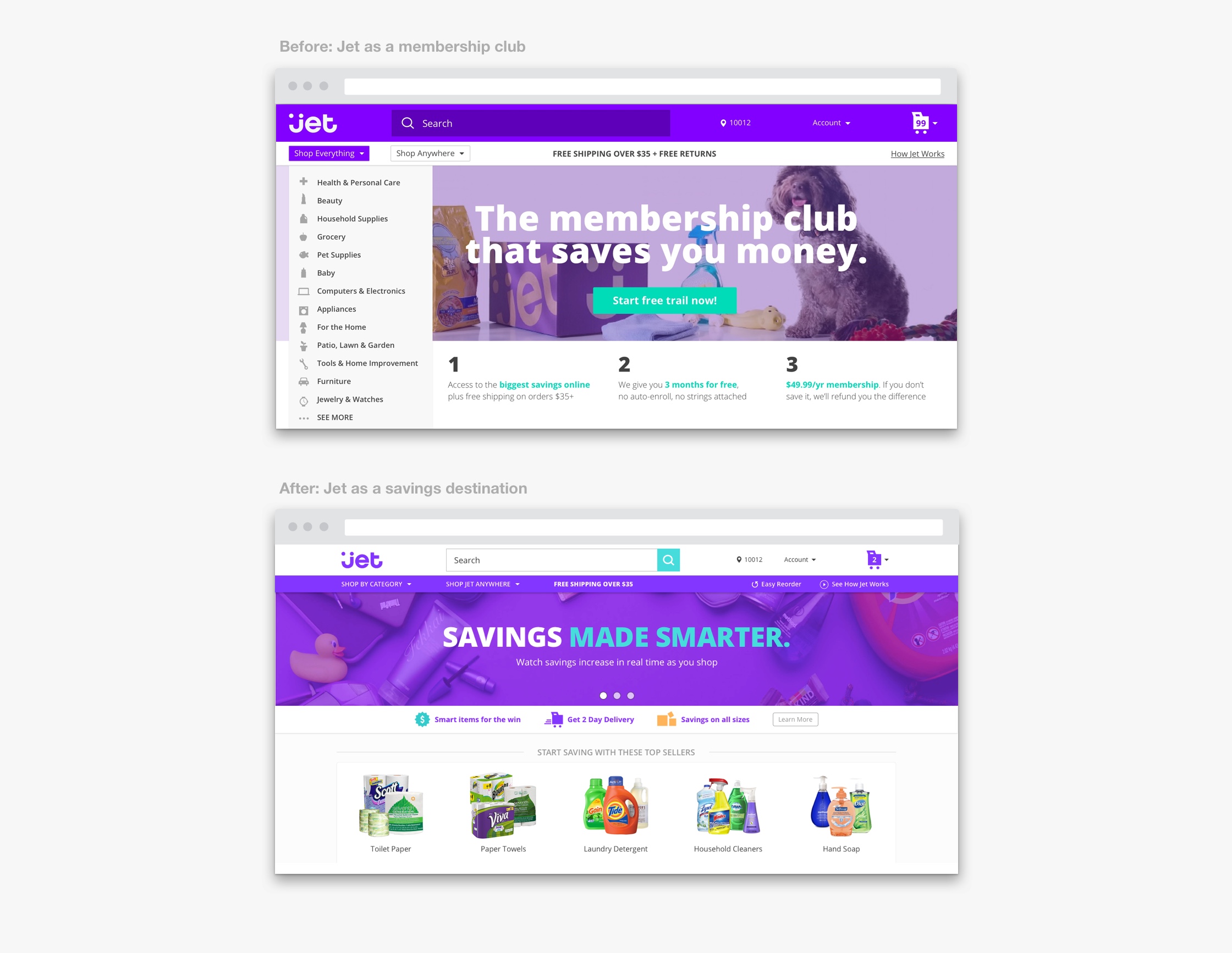
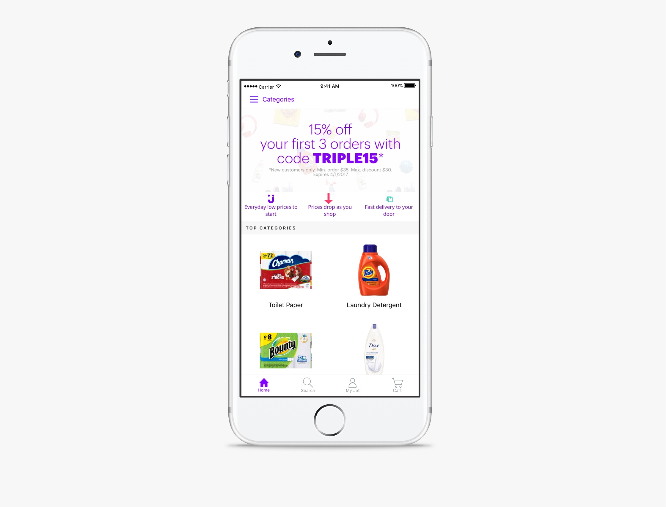
Smart Savings:
Jet finds operational efficiencies around the e-commerce logistics and translates them into savings for its customers.
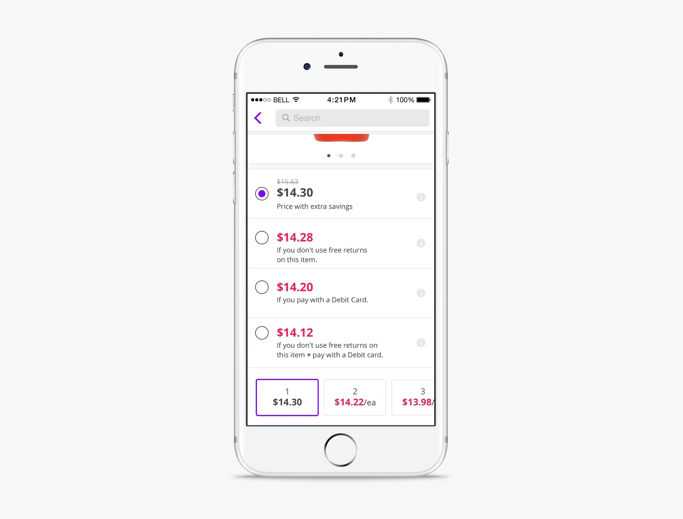
Customers can save in Jet by:
- Opting to pay by debit instead of debit
- Waiving the right to free return.
- Buying items that ship from the same warehouse.
Research
After conducting an extensive research a few weeks after launch (surveys, in-person Testing and site analytics) we identified customers had three main issues with Jet’s shopping experience and value proposition.
1. Customers had a hard time trusting a new and unproven company as Jet.
2. Customers who bought at Jet did not repat after their 1st purchase .
3. Customers did not understand the actual value of “extra savings”.
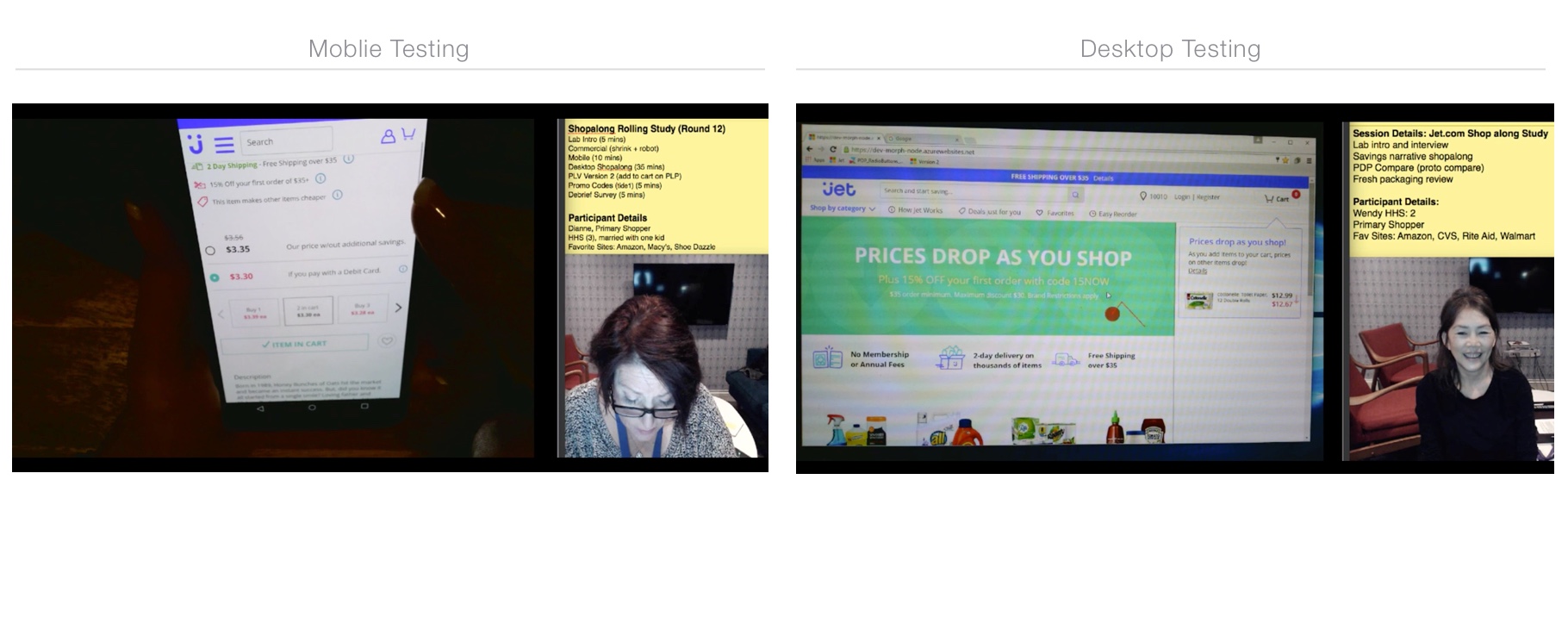
In order to iterate in a fast manner with “real” data the design team, with the help of 2 developers, managed to build a “sand box” version of Jet’s production site. This allowed us to test multiple versions of the experience with real customers as they navigated through key shopping decisions.
Design Iterations
After multiple months and multiple iterations of the experience, we had already a comprehensive list of validated findings and solutions.
1st Finding:
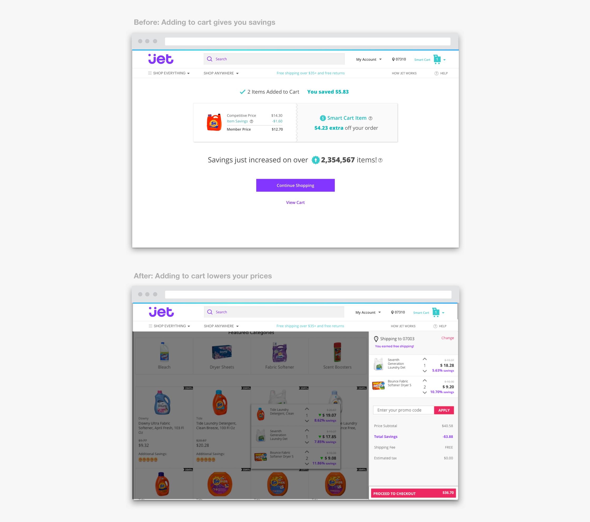
- Customers began to understand how they could get value until they had added a couple of items to the cart.
Design solution:
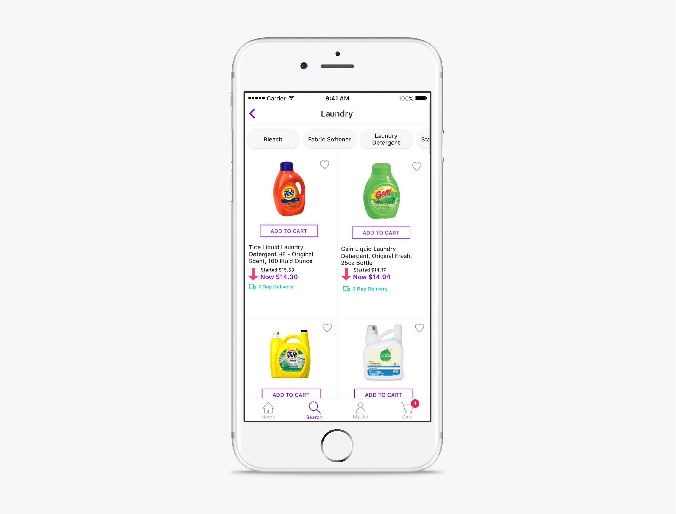
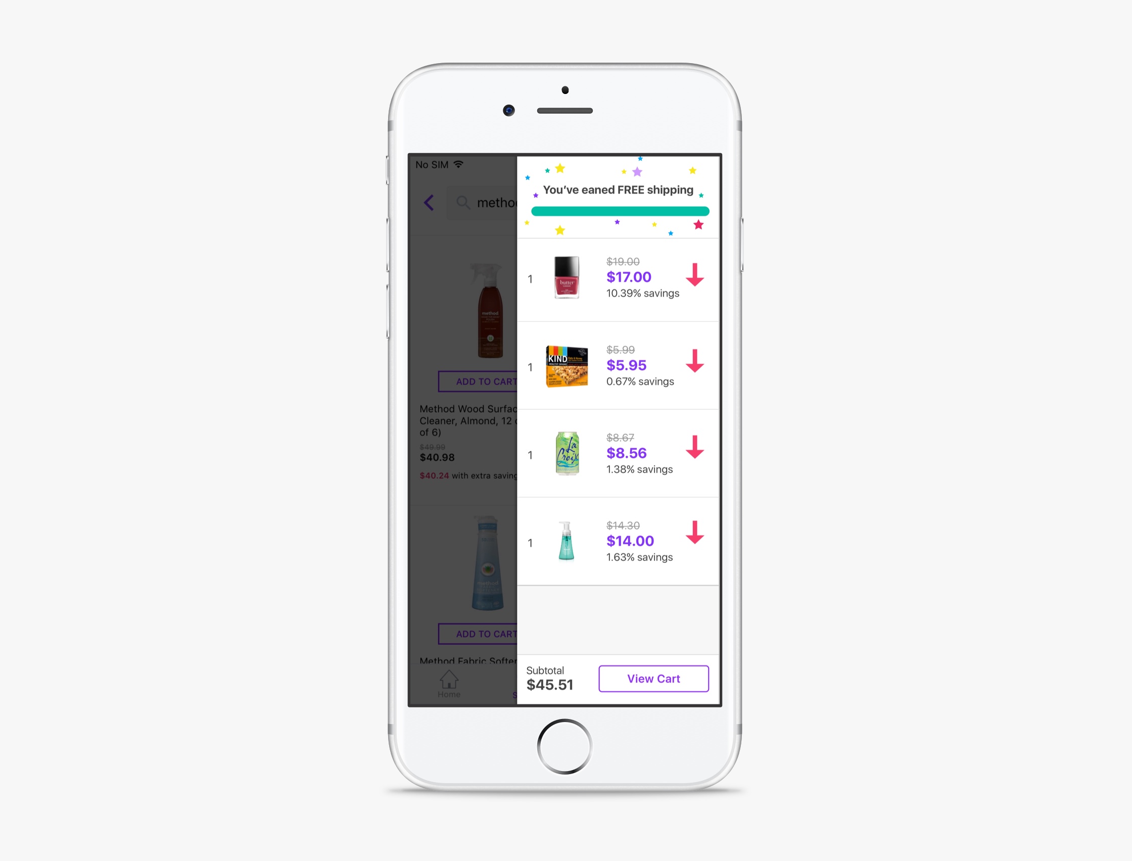
- A persitent cart was designed to show how prices were going down in real tim as customers shopped.
2nd Finding:
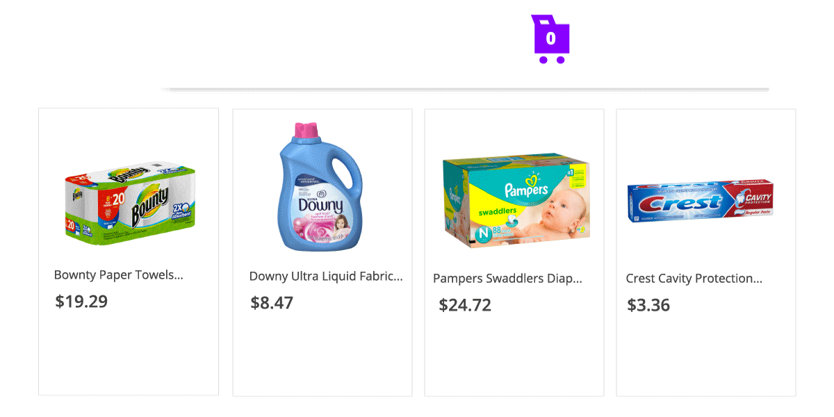
- Customers had a problem doing the math and figuring out how much the items really cost.
Design solution:
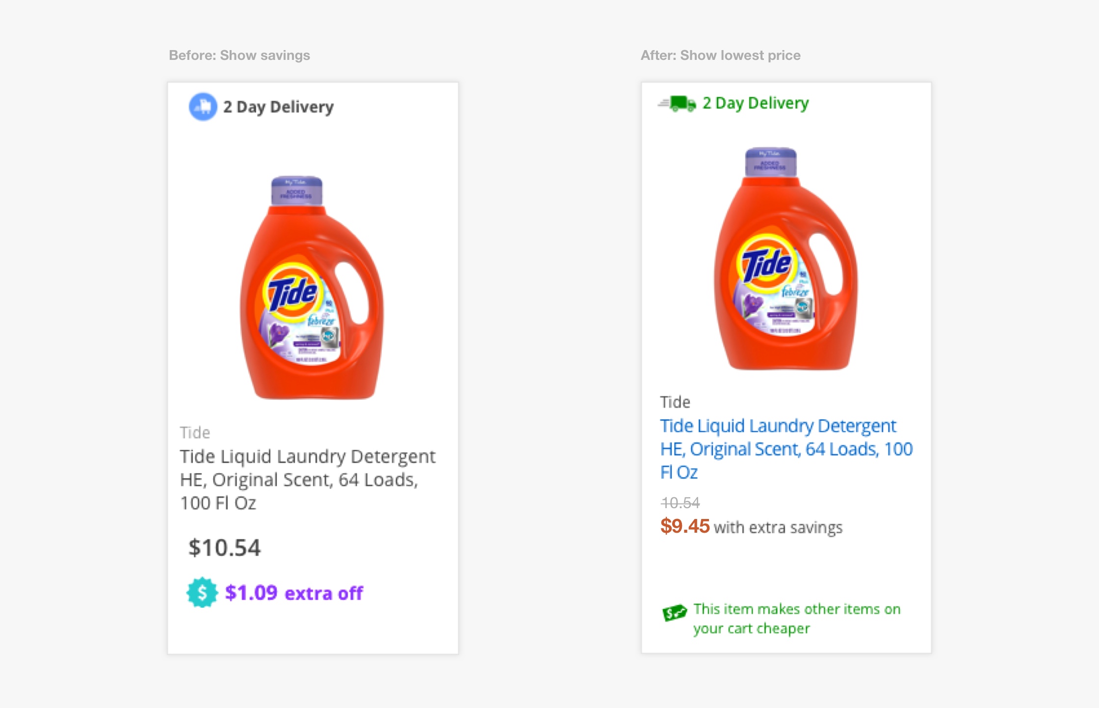
- Show lowest final price in real time across the experience.
3rd Finding:
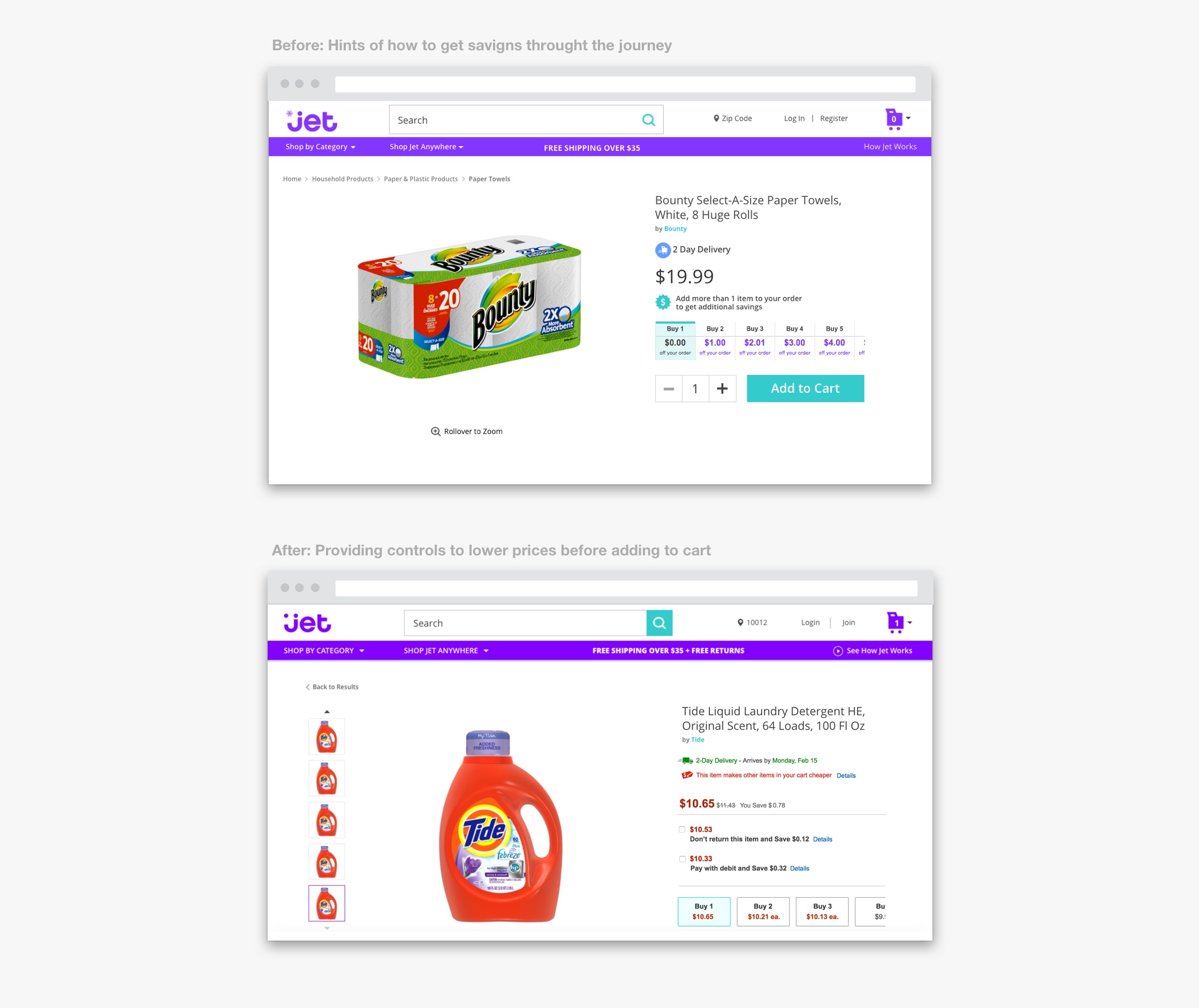
- Customers had a problem making all the savings decisions along the journey and did not understand how much value they could get.
Design solution:
- Provide all relevant controls to lower prices before adding to cart. Click to interact with prototype->
4th Finding:
- Customers were missing how prices were going down in real time.
Design solution:
- Provide guidance and celebrate value with animations.
The solution
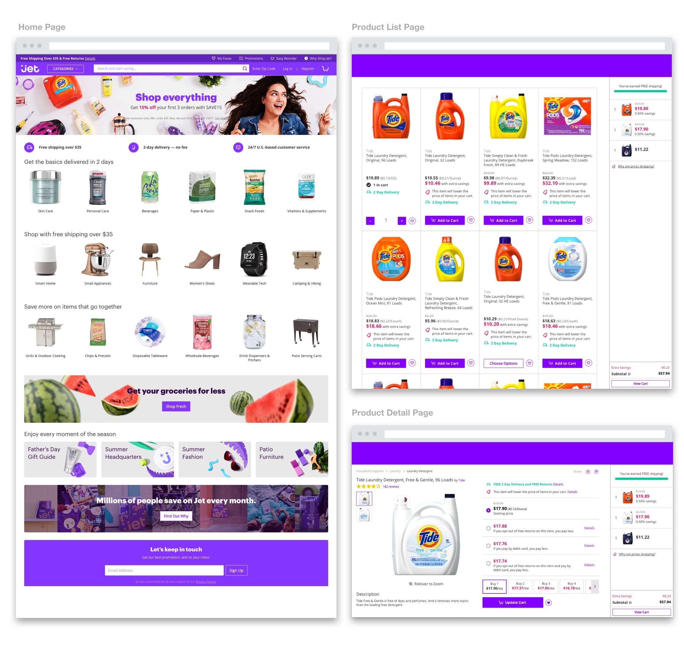
After a few more iterations, we decided on the final interactions and translated them to a complete story across the experience.
3. We exchanged all language around savings and showed lowest possible price in real time.
4. We provided control over how low the prices could go and used familiar colors to show value.
5. We showed value where it mattered (at the moment of adding to cart) and we celebrated it with color and animation.
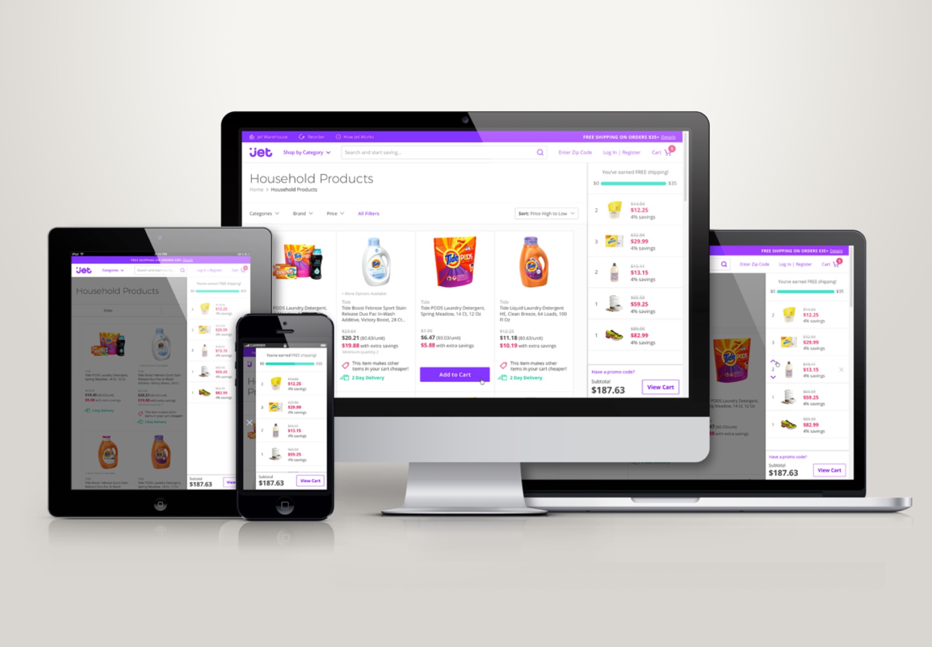
This is how it looked when we put everything together:
Building the solution
As the design process was providing solutions, we began to work with the development team to build the experience into a responsive site and an iOS and Android application. Since most of the customers begin their journey on a mobile device, we made all final design and development decisions for mobile and scaled from there.
Results
As we launched this new experience as an A/B test we conducted another round of quantitative research which found that:
- 8-10 customers understood Jet’s value proposition
- 8-10 customers said Jet’s prices were lower than other sites
- 6-10 customers said they would be willing to purchase at Jet
The qualitive data team, in turn, determined that this had translated into:
- Higher order size
- Higher order value
- Higher average savings
- Higher revenue per visit
In summary, our customers were actually finding value and having fun with the experience we had designed.

Jet’s Redesign
About
Jet’s visual design has evolved in order to adapt to the customers needs and the brand’s strategy.
Goals
User's goal: to connect, recognize, understand and navigate Jet’s experience.
Technology's goal: to create a system that allows for easier and faster implementation of new designed features.
Business' goal: to align brand, creative and UX/UI design to ensure that the experience is cohesive and impactful.
Main Responsibilities
Project Lead
UX Direction
UX Design
Visual Design
Production Design
Credits
Visual Design Direction: Rick Rodriguez, Paula Guzmán
Visual Design: Robin Man, Jessica Anerella
Challenge
As a follow up to the work of establishing Jet’s value proposition, quanititave research showed there was still room for improving the design of the shopping experience:
1. Customers had a problem of trusting and connecting with Jet’s shopping experience because of the quality of its visual design.
2. Customers had a hard time performing certain tasks because the visual patterns were not clear enough.
Process
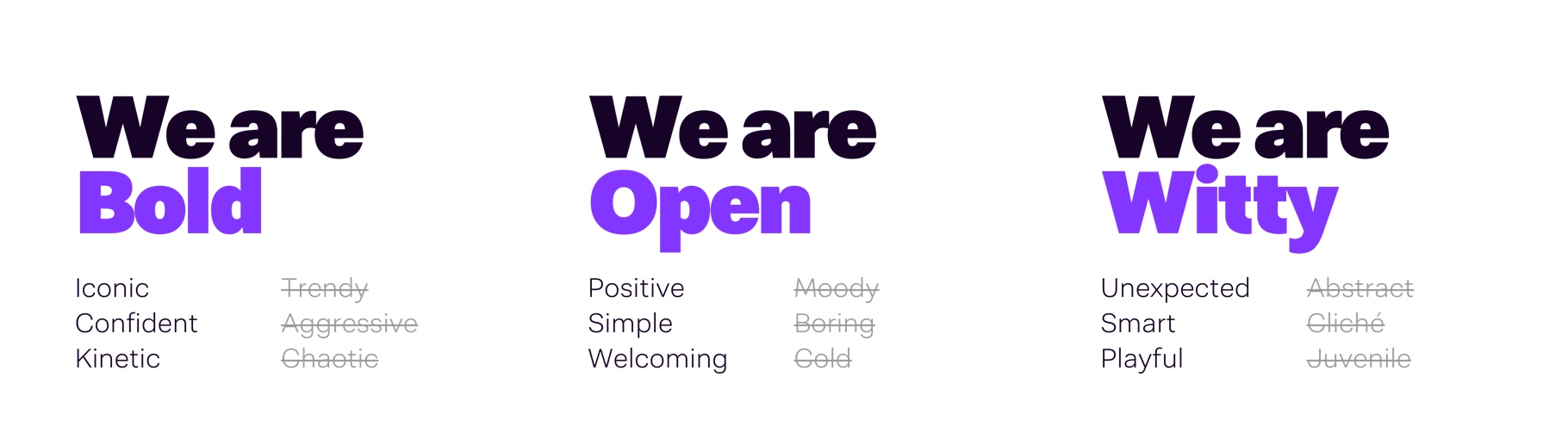
As the project lead, the first thing I did was to approach the creative director and brand lead to create a workforce that would set the vision for a renovated visual desing. As a team, we aligned around our Brand Values but clarified what they stood for.
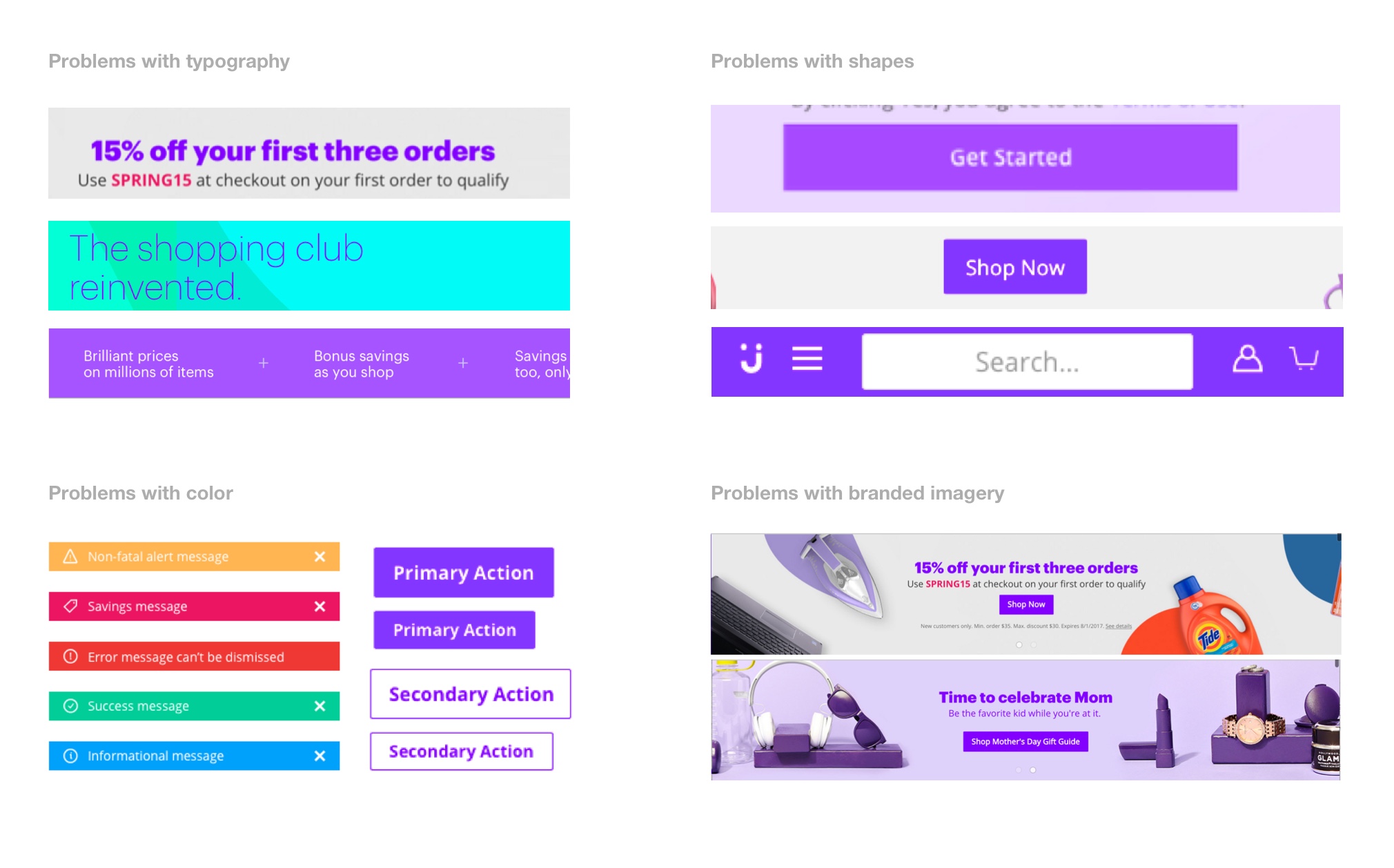
The second thing we did was an audit of our experience which showed four main issues:
1. The font’s we used were not clear enough and did not allow for the range of uses the experience required.
2. The way we used color througout the experience was not consistent.
3. We used multiple shapes in different forms and sizes to denote same call to actions.
4. We needed a consistent POV for branded imagery.
After conducting a competitive analys and initial round of visual explorations, with the entire UX and creative desing teams, we managed to aling in three main foundational principles:
1. Accessibility
2. Efficiency
3. Clarity

Outcomes
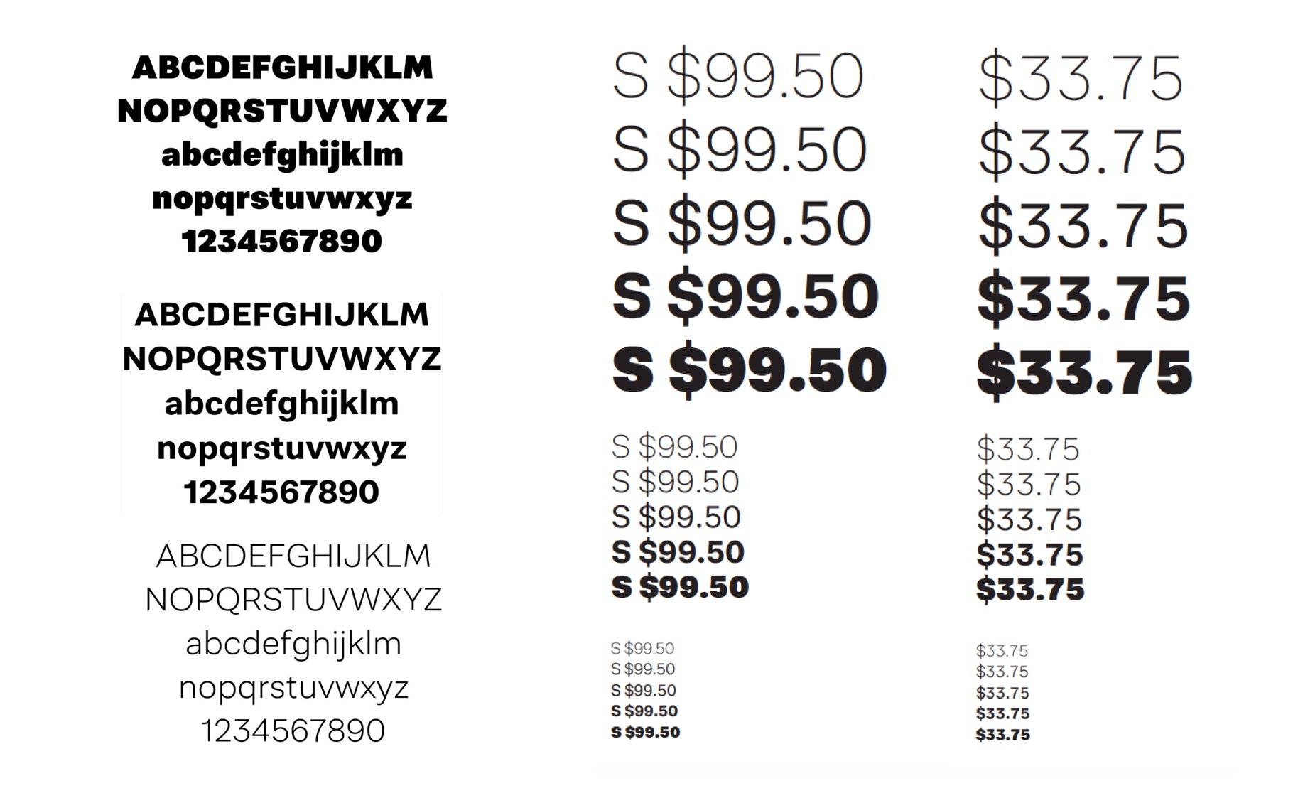
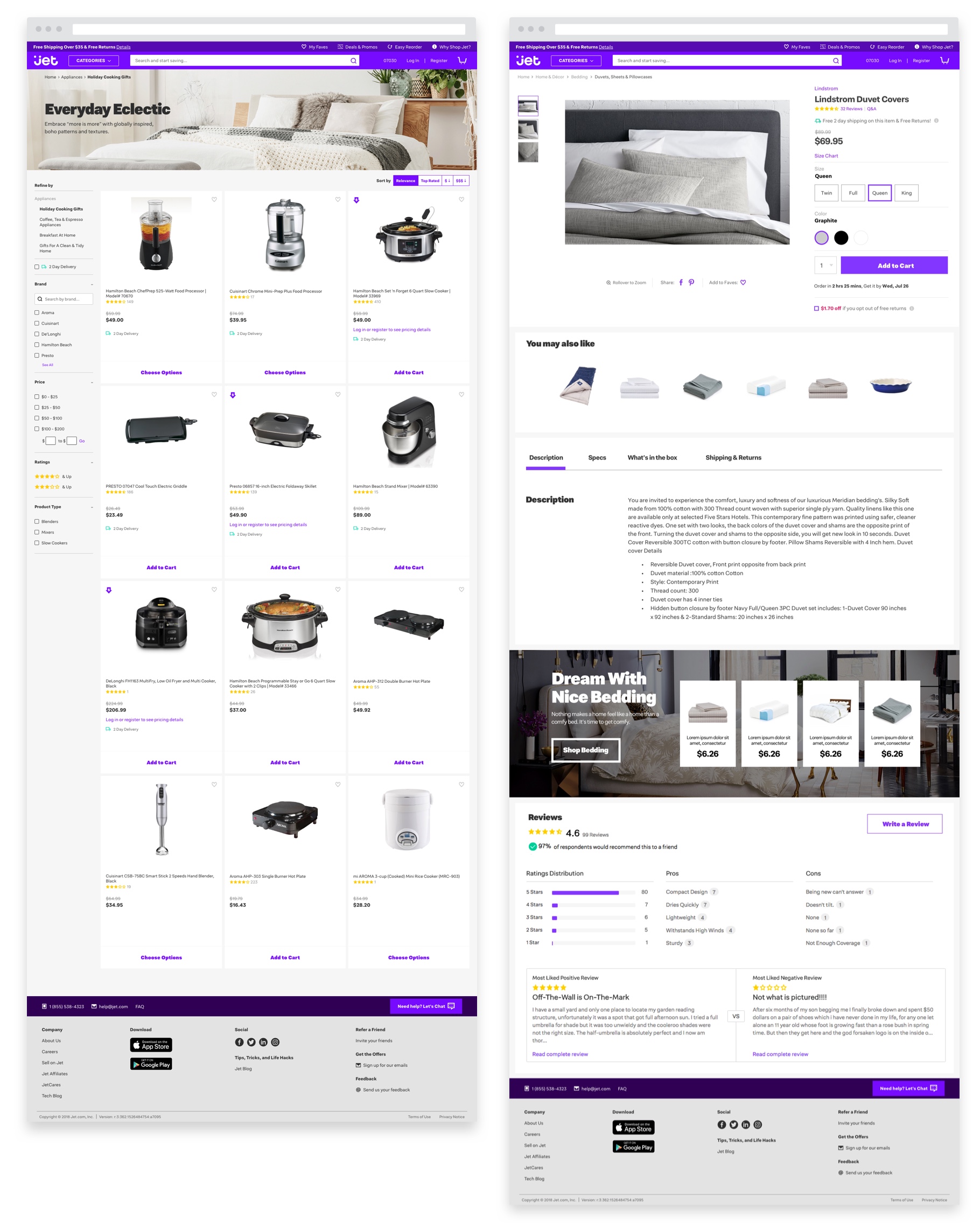
After a couple of iterations on the explorations and directions, there were 2 main outcomes:
1. A new custom typeface (Bloomfield) that allowed for all the multiple needs in terms of copy and prices the Jet experience required. We gave special attetion to how prices would display.
2. A set of templates of key pages that combined the design principles and the new typeface.
In order to align the rest of the company, we organized a “showcase” event were everyone in the company could feel and play with the new design in all the devices. We encouraged everyone to provide their feedback. The event aroused the excitement on employees and executives who helped us champion the project moving forward.
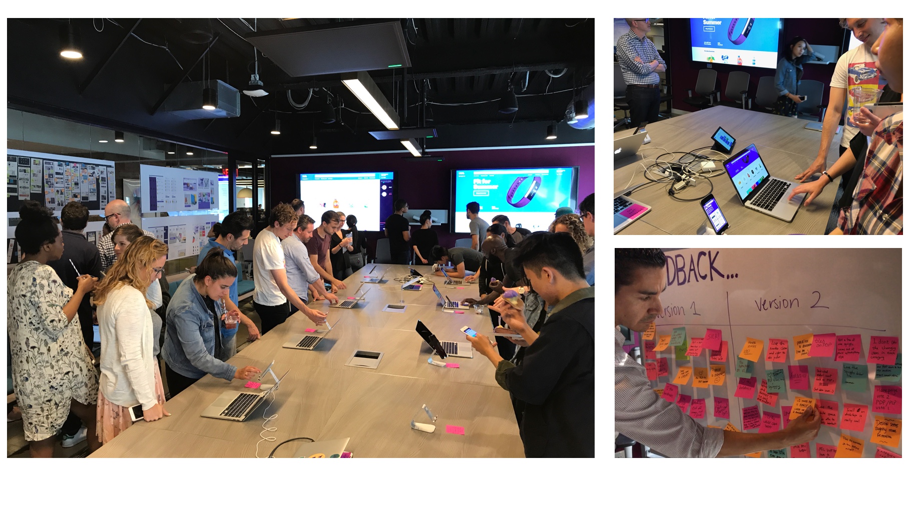
As a fast follow, we implemented the new desing in Jet’s Home page and the Back to School experience. This allowed us to gather 2 quick finidings:
1. Design elements needed to be put into a system that supported design at scale.
2. We had to reach a balance between the boldness and clarity of our principles.

As a foundation for the design system, we decided to follow the atomic design framework. This allowed us to gather the confidence as we decided bigger elements in the experience like new templates.

As a quick way to implement some of the design elements into the production site, the front-end team developed a quick version of the style guide to be used in new built features.
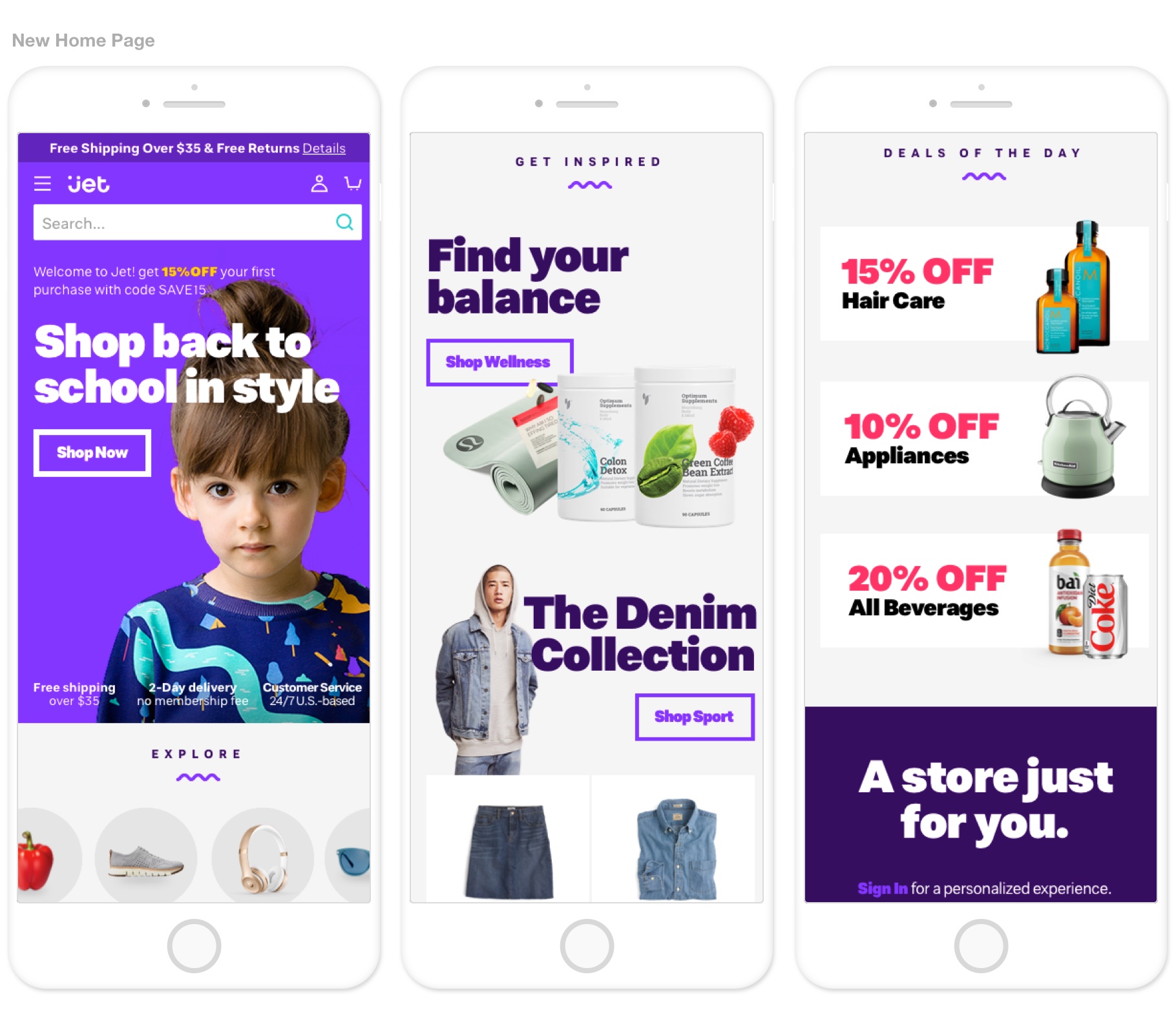
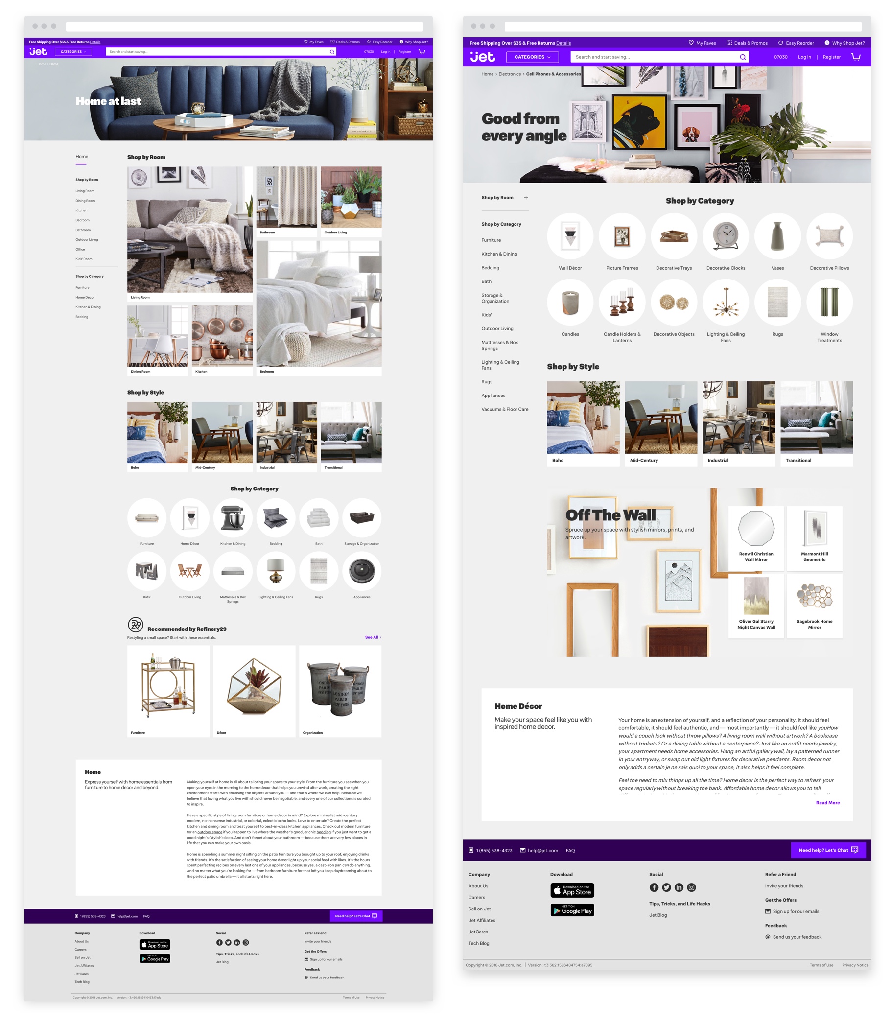
The first category to fully use the new design system was the “home experience”. This allowed for us to gather customers’ and developers’ feedback before we rolled out to the rest of the experience.
Designing for Jet 2.0
As Jet changed its strategy and focused on a more premium customer, the design had to evolve to express the new brand message:
1. Tailored experience
2. Unique Assortment
3. Personal Service
Becasue we had a design system, most of the decisions were made at the atomic level which then affected the larger elements. This allowed for a faster iteration and implementation of the new design.
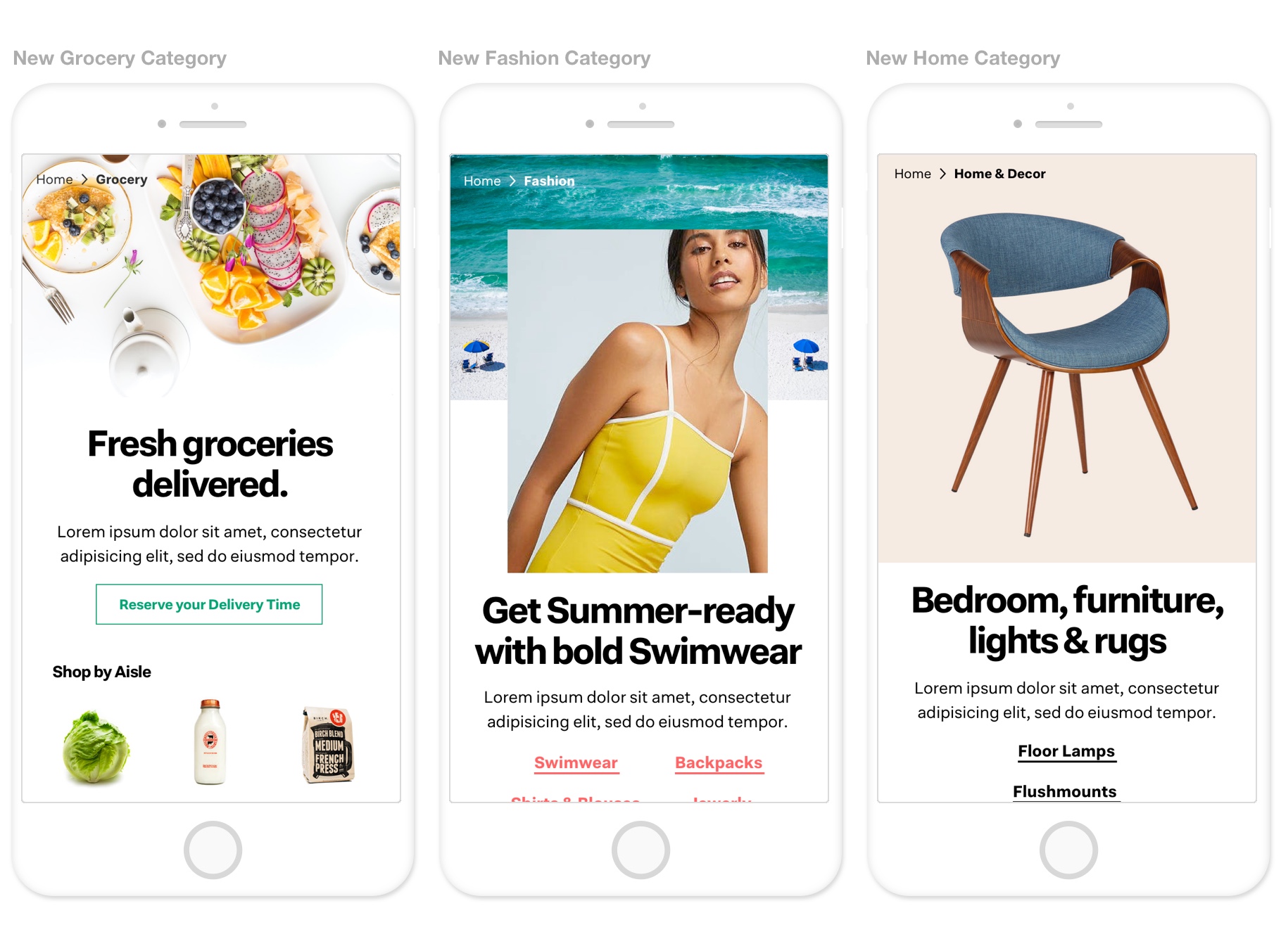
Since the main category for the brand relaunch was grocery, we used it as a model for how to approach the design of the experience.

Results
As we keep iterating, we track NPS comments to capture the sentiment our customers express about the design of the experience. Overall, the feedback has been positive but there are still areas for improvement:
1. Customers appreciate how the look and feel of the experience is elevated.
2. Customers appreciate how clean the site looks and associate it with ease of use.
3. Customers express how the experience feels localized and relevant.

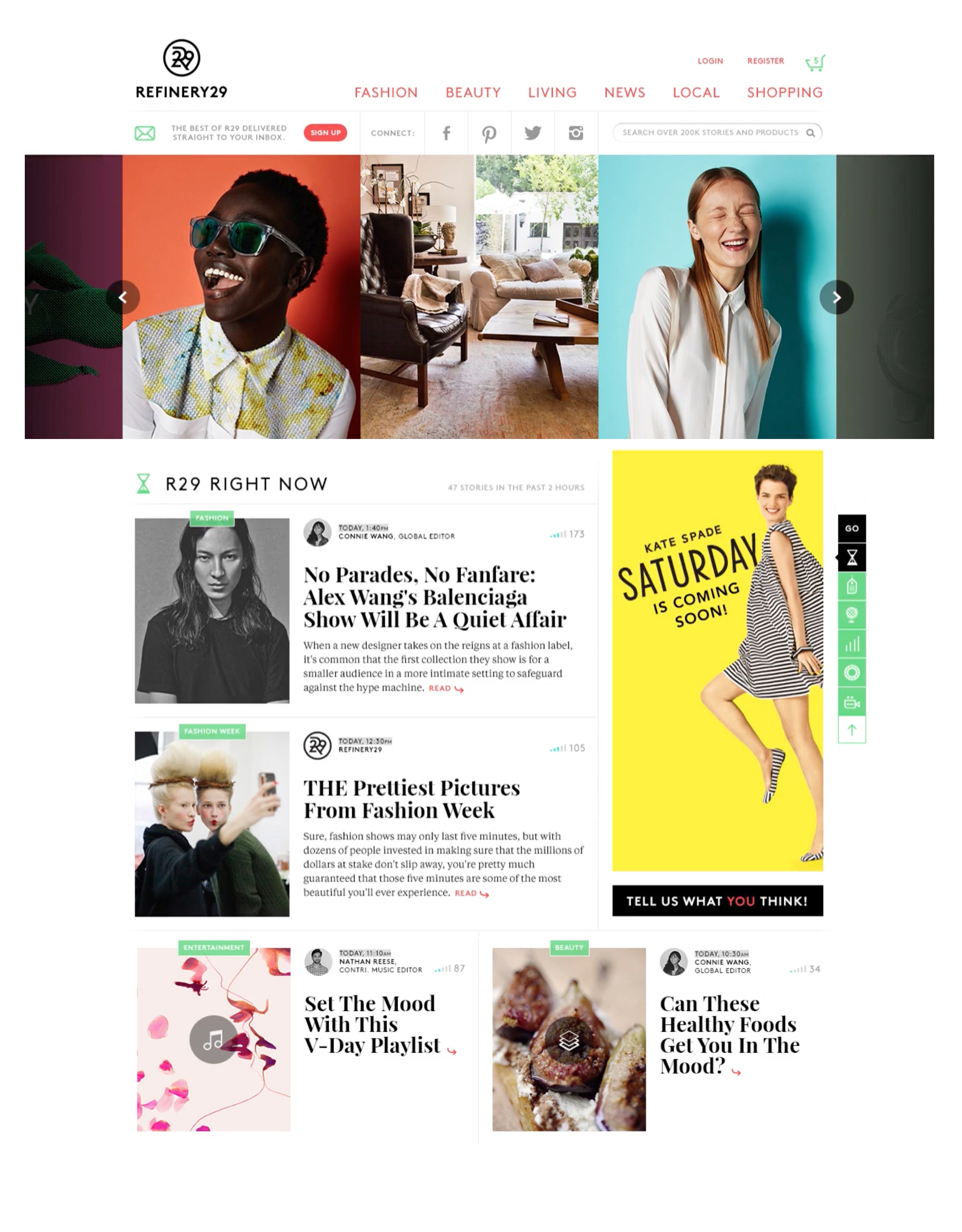
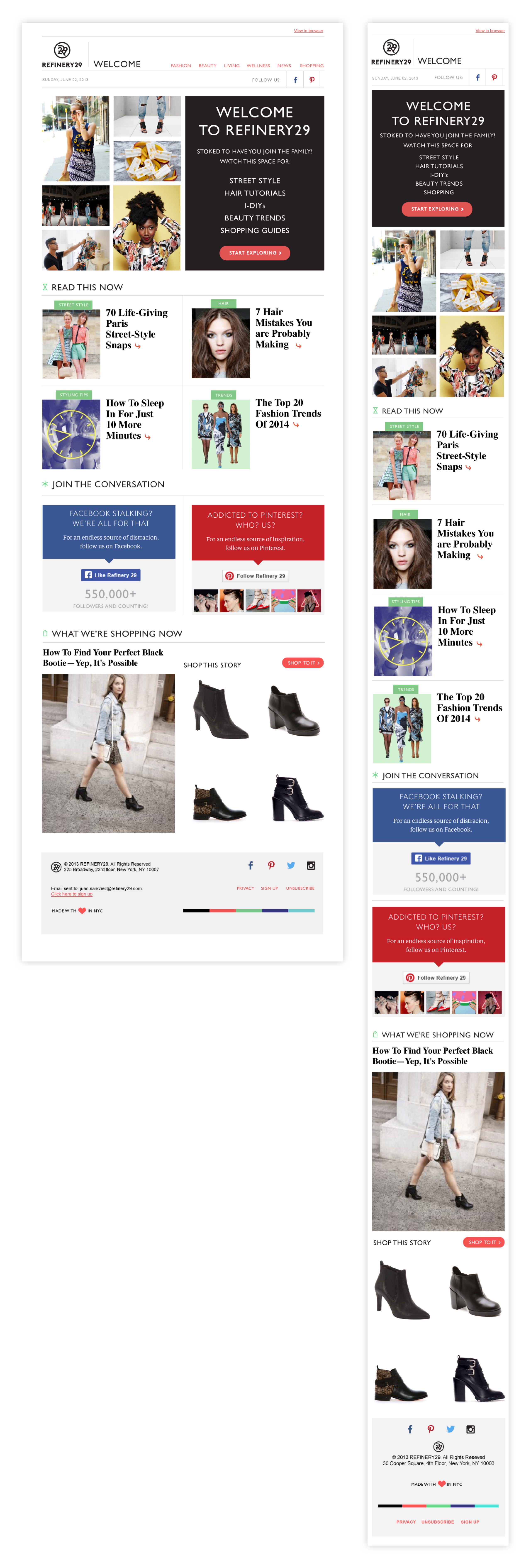
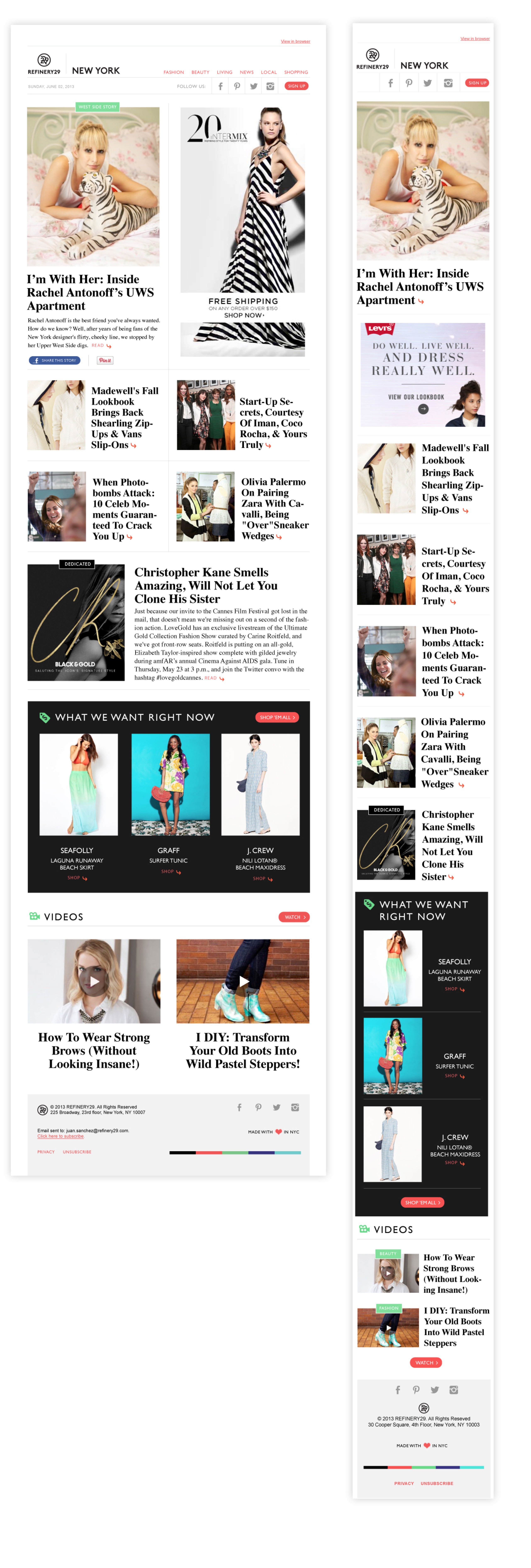
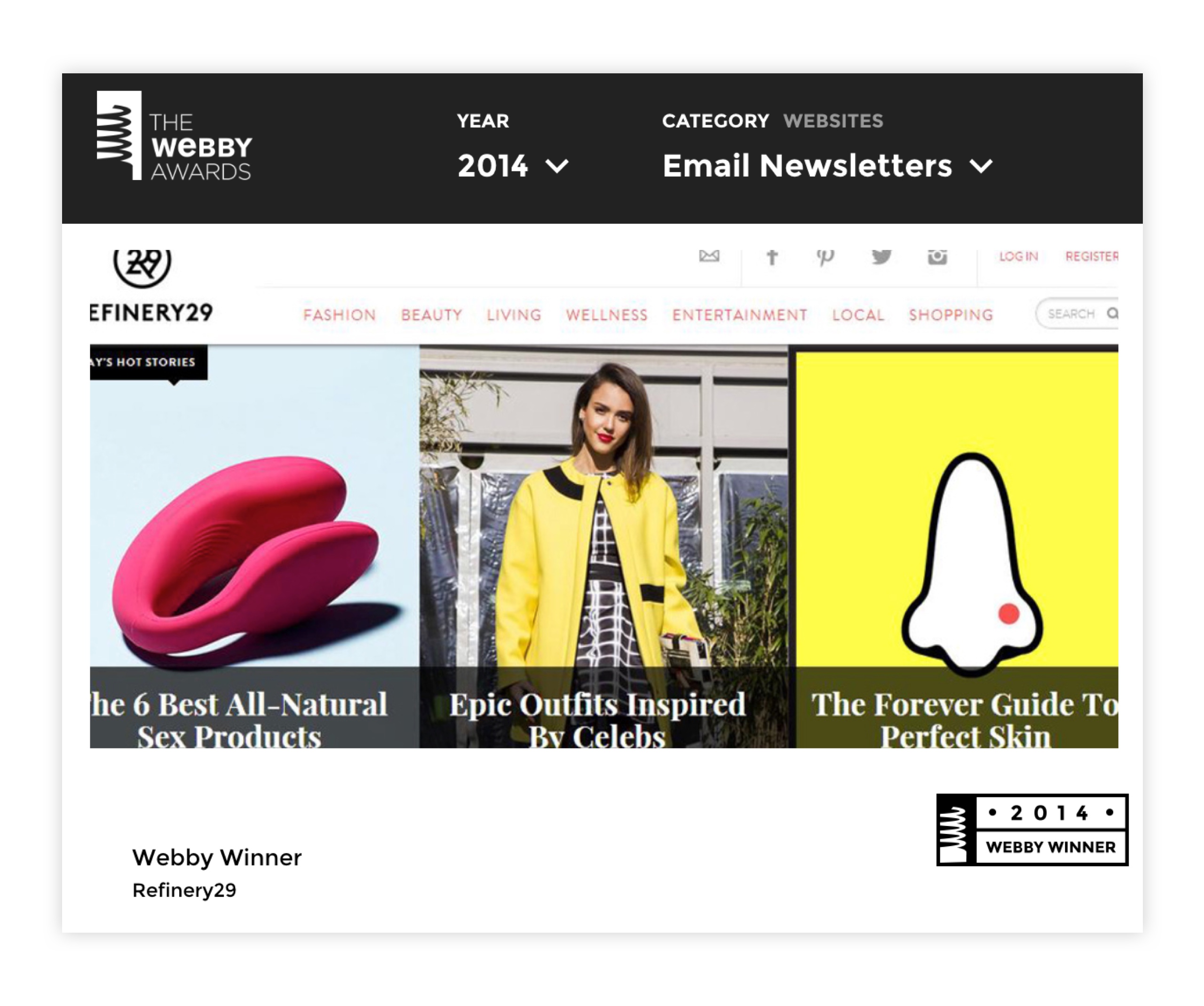
Refinery29 Newsletters
About
How the redesign of Refinery29’s newsletters drove to higher click thru and the company’s first Webby Award.
Goals
User’s goal: to
quickly scan Refinery29’s newsletters and click on the stories based on what relates to them.
Technology’s goal: to create a scalable modular sytem that allowed editors to create new email templates without technical support.
Business’s goal: to drive traffic to the site (to read or to purchase)
My Role
·UX Design
·Visual Design
·Production Design
The challenge
As Refinery29 had relaunched it’s brand indentity and website, the marketing team decided it was a great opportunity to redesign all the emails they sent to the readers:
-
Welcome emails
-
Editorial Emails
-
Dedicated Sponsored Emails
-
Shops Emails
![]()

Research
After conducting research that included stakeholders interviews, competitive analysis, email analytics and layout A/B testing, we algined on solving for three key insights:
1. Inconsistency on branding across all emails.
2. Inability to read emails on mobile devices.
3. Difficulty of manually building the emails by the editors.
Analysis of our current templates
Mobile comparison of our emails on vs. competitors
A/B testing on Layout and CTA’s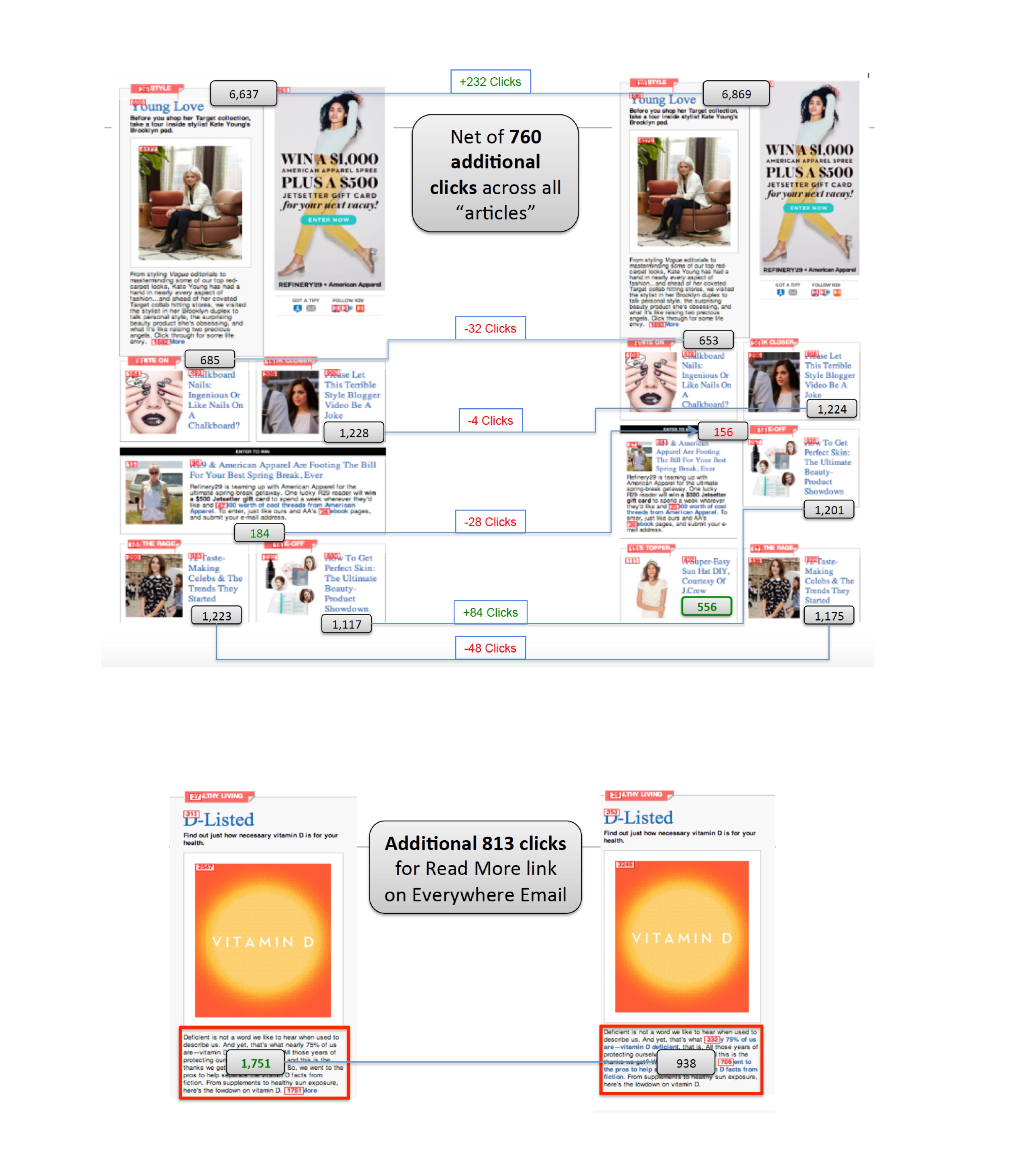
Design
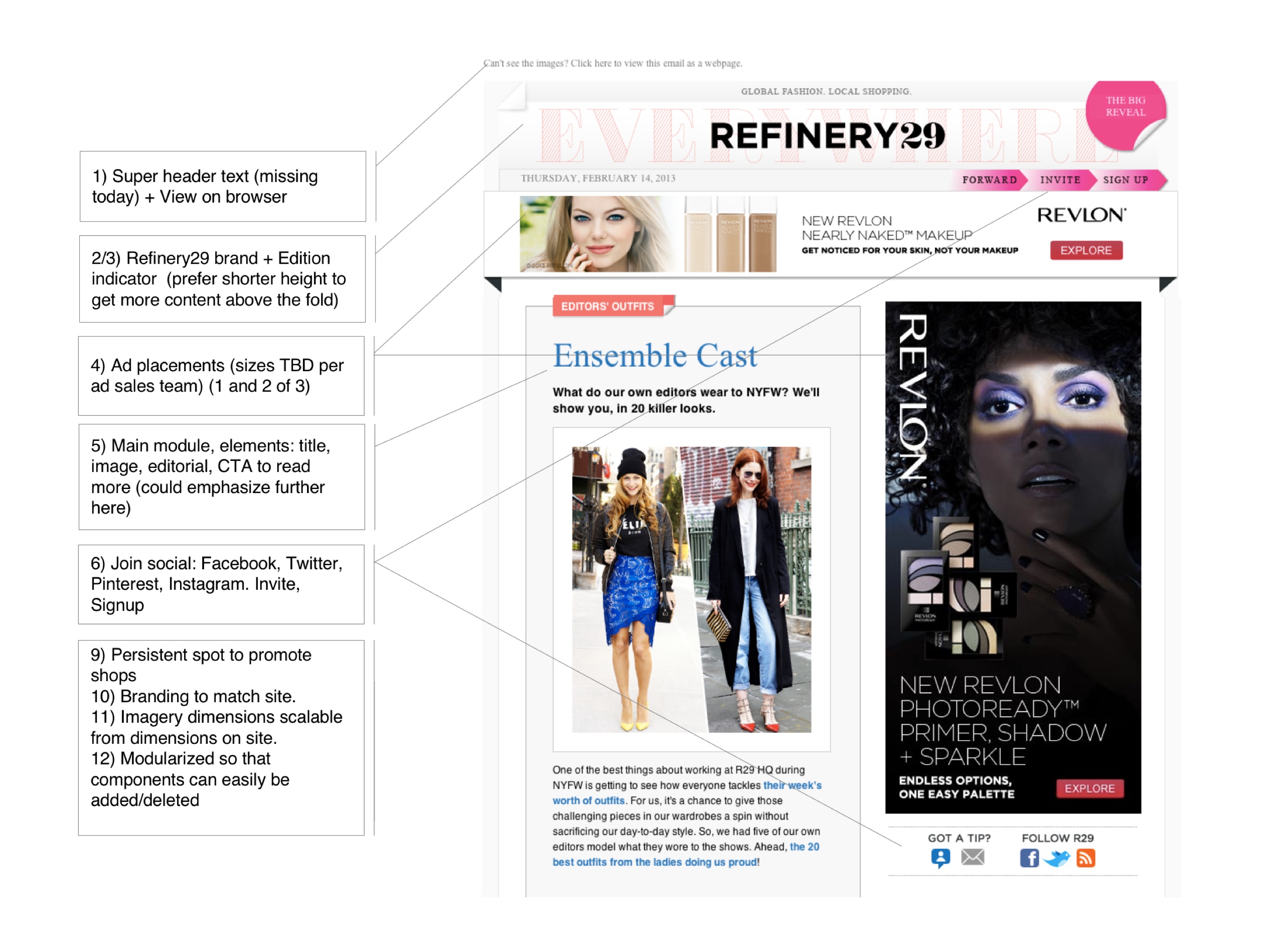
Because I was working with content, I decided to approach this challenge as an editorial problem. The first thing I decided to work on was the grid layout. This helped us:
-
Figure out the type of modules we could design.
-
Understand how we could design a responsive template.
- Make sure we had space for the advertising banners.
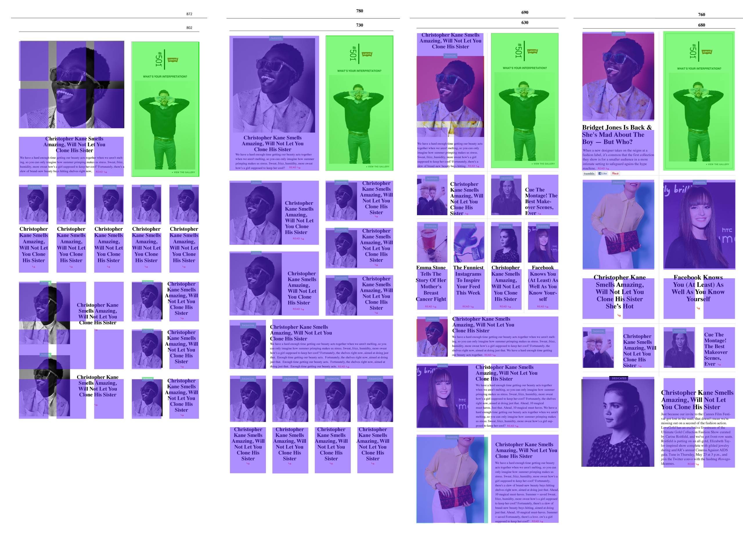
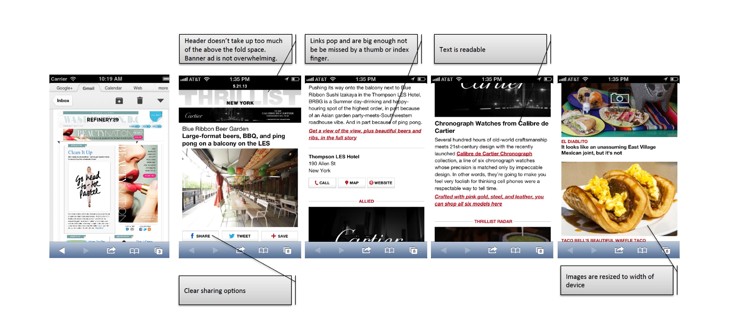
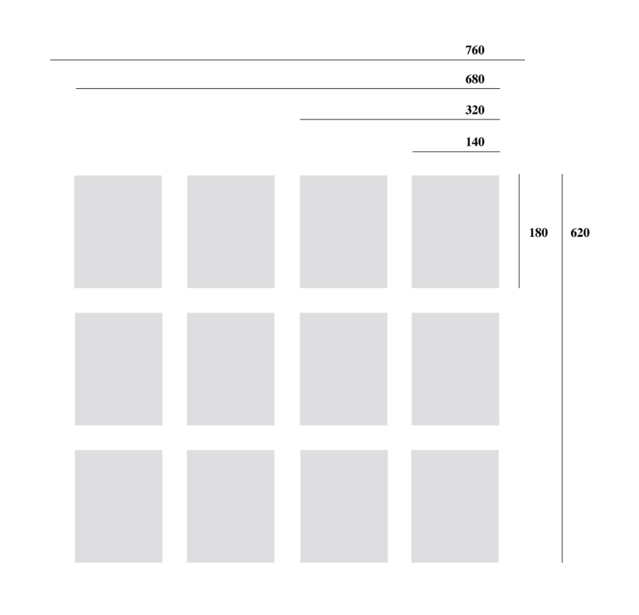
Based on this criteria we decided on a 680 grid that could a 300*600 banner, allowed for a good number of modules based on a single shape, and adapted to 320 mobile screen size.
Since we had just launched a new experience, we decided to design the modules based on what we had built for the website.
Because the main elemets of the modules were the image and the titles, we made a conscious effort to identify the web safe fonts that translated our editorial style.

And we then designed a number of modules that would fit the grid and could host the diversity of the content the editors were adding to the emails.
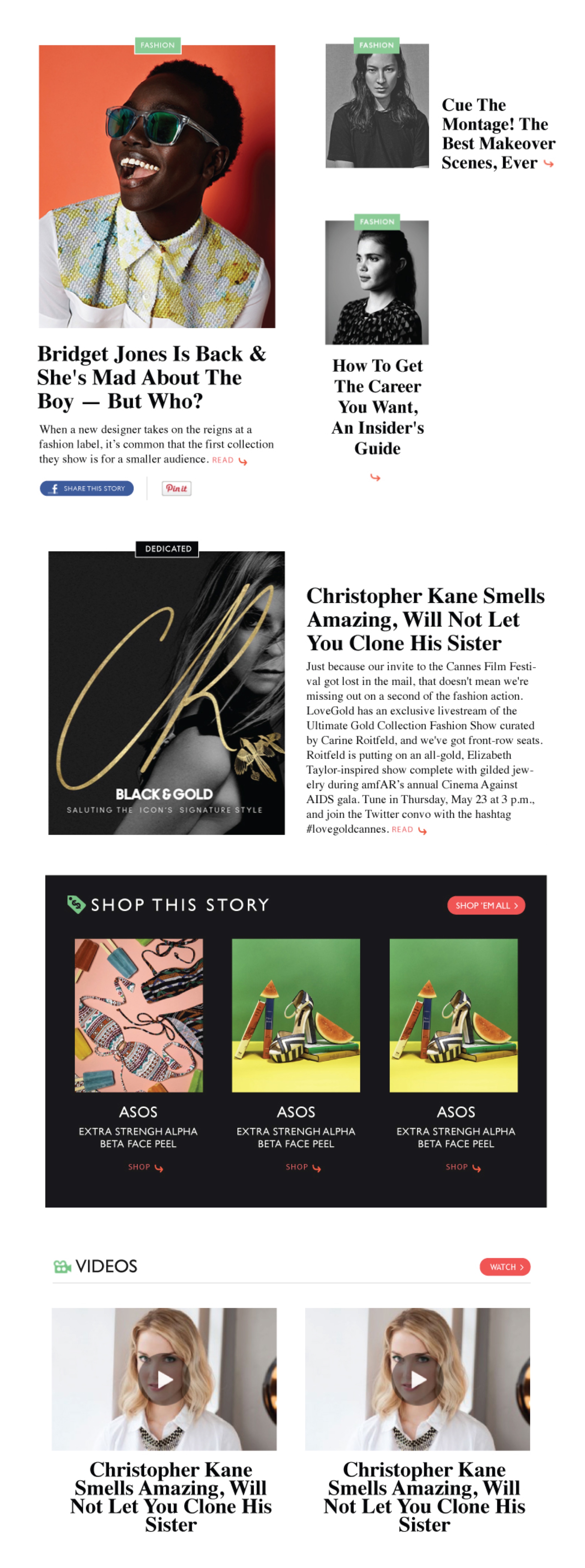
The solution
Once we had the grid and the modules we put together a couple of example emails based on the templates the editorial team had requested.
Welcome Emails
Editorial Emails

Results
The marketing team decided to launch each of the the emails as an A/B test comparing them to the previous templates. The result was overwhelmingly positive in terms of Click Thru on each of the new modules we had designed (some times up to 60% increase), specially on mobile devices (up to 80% increase). It cut by half the amount of time needed to build the emails. It also allowed Refinery29 to win its first Webby Award in 5 years.
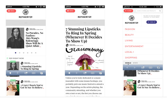
Refinery29 Mobile Web Site
About the project
35% of Refinery29 users are getting to the site through mobile devices. It's estimated that in 2014 the number is going to be above 50%. The current Refinery29's mobile platform is not flexible enough to iterate and find new monetization strategies.
Goals
To create a single, elegant, responsive experiences of Refinery29 editorial, advertising and social content that removes the friction of funnels for the user and enables richer and more frequent advertising opportunities for brand partners.
User goal: to stay within the context of the experience whenever possible, and only remove that context when she decides to (1) navigate to a new type of content, (2) navigate to a hub or topic page or (3) tap on an internal hyperlink.
Technology goal: to create a mobile web app that performs in all critical aspects like a native app.
Business goal: for advertisers to have the ability to (1) display banner ads and (2) experience increased, more predictable engagement with brand integrated content.
Main Responsibilities
Concept definition
UX Design
Visual Design
Previous Site
Sketching
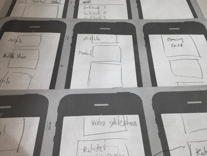
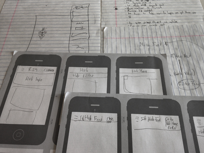
Wireframes
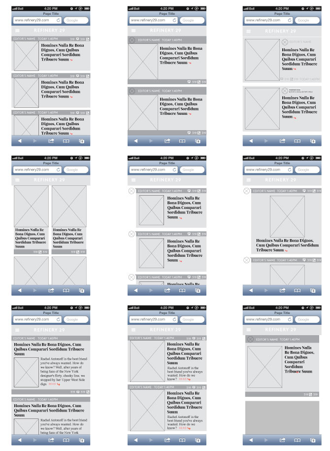
Wireframes V02
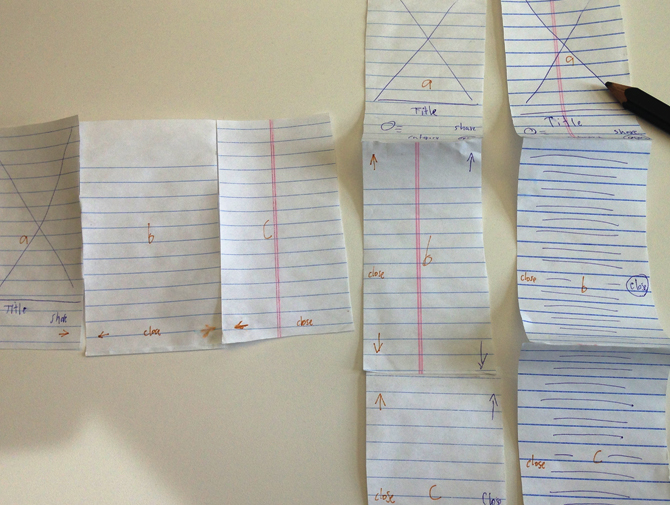
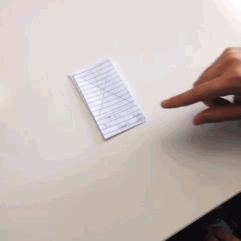
Paper Prototype
Navigation Flows
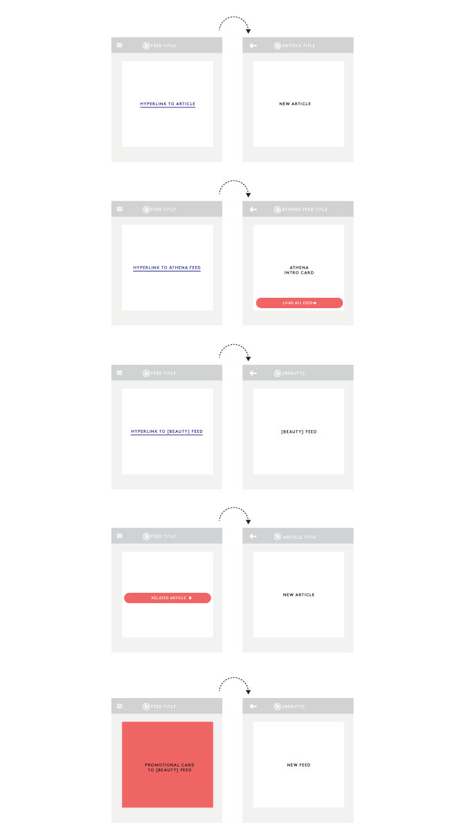

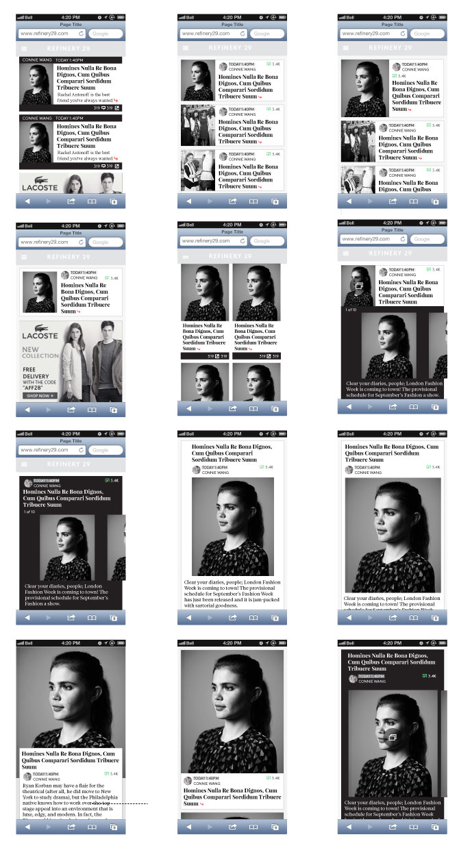
Visual Definition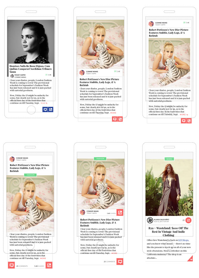
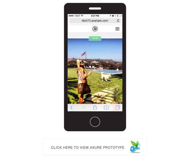
Axure Prototype
Visual Definition V02
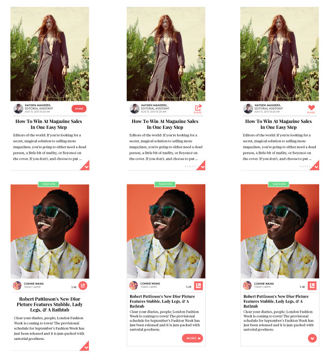
Live Site

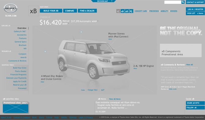
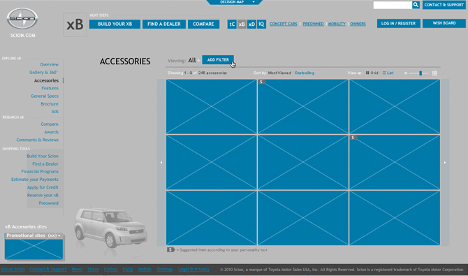
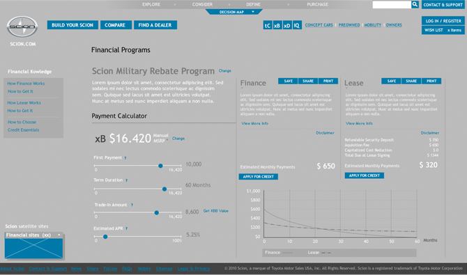
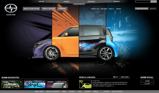
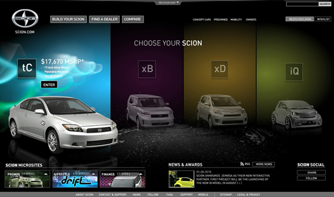
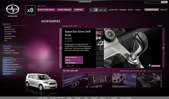
Scion.com
About the project
In 2010 Toyota selected Zemoga as one of several agencies to help redesign Scion.com's web site. We set up a multidisciplinary team that involved information architects, visual designers animators and developers that worked together for 4 weeks in the proposal.
I had the chance to define the final concept for the whole proposal based on the client's brief and multiple strategic tools that aligned with the projects goals of leading Scion's customer to buy a customized car. I also defined and executed the interaction design and directed the development of the delivered prototype.
Main Responsibilities
Concept Definition
UX Definition
Interaction Design Direction and Execution
Agency
Zemoga
Sketching and Concept Definition
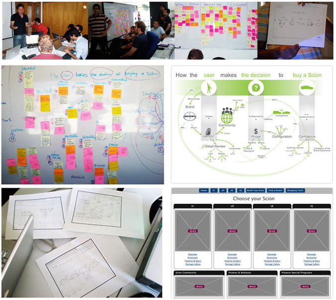


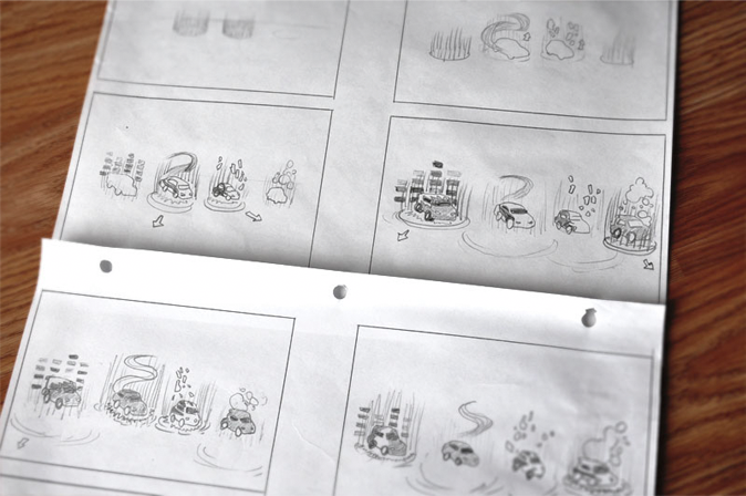


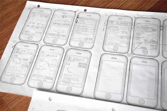
Wireframes
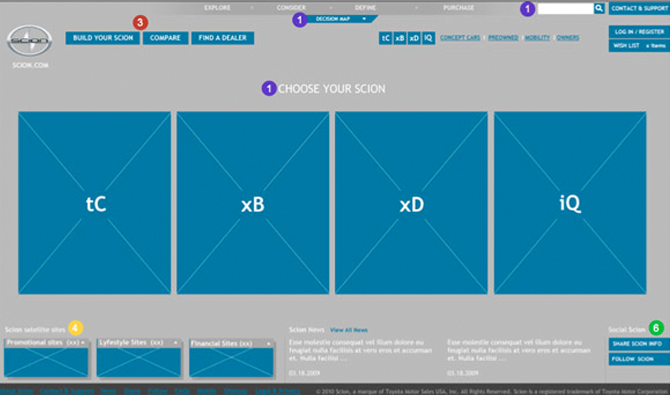

Design Mockups

Video / Prototype
First round proposal video demo
Second Round proposal video
Behind the scenes video